
Ever tried opening a site on your phone and ended up zooming in just to read a line of text? Or maybe you pulled it up on a tablet and the layout looked broken, nothing like the desktop version. Annoying, right? Most people don’t stick around when that happens, they just click away, which is the last thing a business wants.
This is where responsive web design techniques step in. A website should adjust itself to the screen, no matter if it’s a phone, laptop, or even a big desktop monitor. When the site adapts smoothly, it keeps visitors engaged instead of pushing them away. It also works hand in hand with SEO to improve your search rankings. On top of that, it makes online advertisements more effective because landing pages look good and function properly on every device.
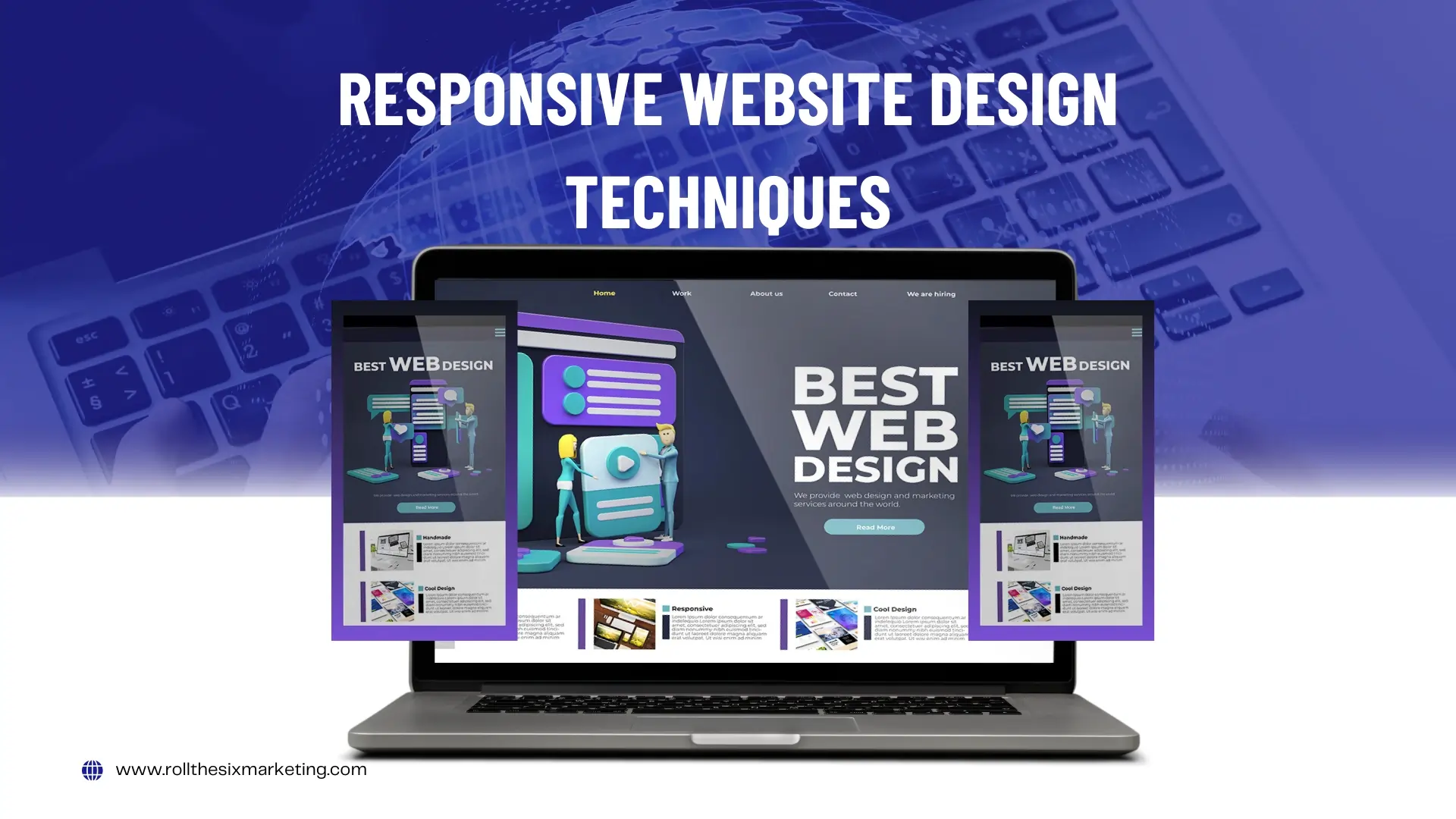
In this article, I will break down some of the most effective responsive web design techniques you can use today. We’ll explore practical methods like fluid grids, scalable images, CSS media queries, and mobile-first design.
Core Techniques
Fluid/Grid-Based Layouts
Have you ever opened a site on your phone and had to scroll sideways just to finish a sentence? Annoying, right? That usually happens when the layout is fixed and doesn’t adjust to different screens. That’s where fluid grids save the day. Instead of sticking to stiff pixel sizes, they use percentages. This way, the content can stretch, shrink, or move around depending on the screen.
Picture this: on a laptop, you might see three columns showing products side by side. Open the same page on your phone, and those three neatly stack into one column. No awkward zooming. No endless sideways scrolling. Just a smoother experience all around.
CSS Media Queries (Breakpoints and Device Targeting)
Media queries are basically rules that tell your site how to act on different screens. You can think of them like the site is paying attention to the device and adjusting itself. Say someone opens your site on a phone. A media query can bump up the heading size so it’s easier to read without zooming. On a tablet, you could drop a four-column layout down to two so it doesn’t feel squished.
It’s really just like tailoring clothes. One shirt can be altered to fit different people, and media queries do the same job for websites. They make sure the page still works and looks good, no matter if it’s on a phone, laptop, or something in between.
Flexible Images and Media
Images that look great on a big desktop screen can be a real pain on mobile. A file that’s too large slows everything down and users end up zooming or scrolling just to see it properly. Nobody likes that.
That’s why we use little tricks to keep things smooth. A rule like max-width: 100% makes sure an image shrinks to fit the screen instead of breaking the layout. And with tools like srcset (An HTML Attribute), the site can actually choose the right image size for each device.
Think of an online store banner. On a laptop you might load the full high-quality version. But on a phone there’s no need for that heavy file. A smaller one does the job and keeps the page loading fast.
Viewport Meta Tag
If you don’t add the viewport meta tag, your site on a phone will usually look tiny. Everything shrinks down, and people have to pinch and zoom just to read. That gets old really fast. The fix is simple. Drop in the viewport tag and it tells the browser, “scale this page to the device width.” It’s a small tweak, but it makes the whole experience feel normal on mobile instead of frustrating.
Modern CSS Layouts
Flexbox (One-Dimensional Layouts)
Flexbox is one of those tools that makes layouts way easier. You can line things up in a row or stack them in a column without fighting with a ton of CSS. Picture a row of little social media icons sitting in a website footer. On a laptop, they sit neatly side by side.
But when the site opens on a phone, Flexbox can shift them into a vertical column automatically. No extra code, no mess, and the design still looks clean.
CSS Grid (Multi-Dimensional Layouts)
CSS Grid takes layouts a step further by handling both rows and columns at the same time. For example, a news homepage with featured stories, ads, and sidebars can stay balanced across devices. The grid makes the structure flow naturally, almost like an invisible planner organizing content.
It’s one of the most powerful tools in modern responsive web design techniques.
Design Principles & Best Practices
Mobile-First Design
Most people grab their phones when they want to look something up online. Desktops usually come later. That’s why it just makes sense to design for the phone first. Get the basics right on the small screen, then build it up for tablets and desktops. At first it might feel a little backward, but it actually works better.
The mobile-first approach is now one of the smartest ways to do responsive design because it keeps the important stuff clear and easy to use on any device.
Content-First, Not Device-First
A strong website doesn’t start with guessing what device people might use. Instead, it starts with the content. If the text, images, and calls to action are clear, they will adapt well to any screen size. Think of it like telling a story—when the story is strong, the format naturally adjusts.
Keep Everything Flexible & Minimalistic
Crowded pages are tough to look at and make it harder for visitors to focus. A flexible layout with a clean, minimal design makes things easier. People can find what they need faster without distractions. A simple site also loads quicker, which makes the whole experience better.
Think about a restaurant website. If it shows just the menu, opening hours, and contact details, it works well. If it’s filled with heavy animations and extra clutter, most visitors will leave before they even place an order.
Use SVGs for Scalable Graphics
Logos and icons should look sharp on every screen. The problem with PNGs or JPEGs is that they can blur when you resize them. SVGs don’t have that issue because they always stay crisp. Think of a brand logo. On a phone it needs to look clear, but the same logo should also look just as sharp on a massive billboard.
That is where SVGs shine. It feels like a small detail, but using scalable graphics is one of those little steps in responsive design that makes a big difference.
Smart Use of Breakpoints
You don’t need to add a breakpoint for every single device out there. It is better to focus on the most common ones like mobile, tablet, and desktop. Keeping it this way makes the design simple, consistent, and easier to manage without turning the CSS into a headache.
Think about an online clothing store. On phones the layout can be adjusted for quick scrolling. On tablets it can be refined to use the extra space. And on desktops it can expand fully. By covering these three, you reach almost every user without overcomplicating the process.
Progressive Enhancement
Not every browser can handle the newest features, and that is fine. A website should still work for everyone. Progressive enhancement is the way to do it. Start with the basics so the core stuff always runs, then add the extra features for newer devices and browsers.
Think of a simple contact form. At the very least, it should let people type in their details and hit send. That works everywhere. But if someone is on a modern browser, you can make it nicer with things like auto-fill or live validation.
Alternatives & Hybrid Approaches
Adaptive Web Design (AWD)
Adaptive design works by setting fixed layouts for certain devices. Instead of one flexible setup, the site loads a version made for mobile, another for tablets, and another for desktops. Take a news site for example. On phones, the page might show fewer images so it loads faster. On desktops, you get the full layout with all the extras.
This approach gives designers more control, but it also means extra effort since every version needs to be updated. Many businesses now mix adaptive design with Responsive Web Design Techniques to balance flexibility with control.
Using Responsive Web Design Techniques keeps the core site smooth while adaptive layouts handle the fine details for different devices.
Hybrid Models
Some businesses go with a mix of responsive and adaptive design. It is kind of a hybrid model. Most of the site stays flexible, but certain parts load in a unique way depending on the device. Take an online store for example. The product grid might be responsive so it reshapes itself across screens.
But the checkout on mobile could have its own custom layout to make it easier for people to finish a purchase. This mix lets websites use the strengths of both responsive design techniques and adaptive strategies.
Common Challenges in RWD
Ad Serving Limitations
Ads are usually made in fixed sizes, and that can cause issues on a responsive site. A banner that looks fine on a desktop might completely mess up the layout on a phone. To avoid that, developers often use flexible ad containers that can resize, or they serve different ad sizes that fit better on smaller screens.
Browser Compatibility
Browsers don’t all play nice with modern CSS. Something that looks fine in Chrome might look broken in an old Safari. That’s why testing matters. You check across browsers so every visitor gets a smooth experience, no matter what they use.
Testing Across Screen Sizes
There are so many devices out there, each with its own screen size. A site that looks perfect on the latest iPhone might look broken on a cheaper Android. That’s why cross-device testing is so important. You want to check how your site runs on different screens before you launch, so every visitor gets a good experience.
Testing & Tools
Browser Developer Tools
Most modern browsers already have tools built in. Chrome, Firefox, Safari, they all do. You don’t need to install anything extra. With these tools, you can check how your site looks on different screens right from your computer. Switch to tablet view, then mobile, then back again.
It takes seconds.It’s a quick way to spot problems before anyone else does. No need to grab ten devices just to test. It just works.
Emulators & Validators
You probably don’t have every phone or tablet sitting on your desk. That’s where emulators and online tools come in. BrowserStack is a good example. It lets you see how your site runs on hundreds of different screens. Handy, right?
Using stuff like this gives you a clear picture of what real users will see. It makes sure your responsive design works the same way everywhere, not just on your own device.
Performance Optimization
A responsive site isn’t just about fitting every screen. It also needs to load fast. Big scripts, heavy images, or messy code can slow everything down.There are easy fixes. Lazy loading helps by only pulling in images when someone scrolls. Compressing images makes them lighter. Cutting down script size speeds things up too.
Think about an online shop. If the product pages pop up quickly, shoppers stick around. If it drags, they leave. Speed keeps people engaged.
Industry Examples & Competitor Insights
Global Best Practices
Big brands already nailed this. Nike. Asos. H&M. Their sites just work on any device. Open a Nike product page on a laptop. Then try it on your phone. Same smooth feel. Pictures resize, buttons fit the screen, no hassle.
That’s the point. Good design isn’t only about looks. It makes shopping easy. And when it’s easy, people buy more and keep coming back.
Leading US Competitors
In the US, big names already lean on responsive design to stay ahead. Amazon and Walmart focus on speed, simple navigation, and clear layouts. Search for something on Amazon. The site adjusts right away. Reviews, prices, checkout. All easy to use on phone, tablet, or desktop. No fuss.
The companies that skip responsiveness usually lose users fast. People will not stick around if the site feels clunky.
Current Trends & Inspirations
Modern design goes further than just shrinking content. Tools like UXPin, BrowserStack, and Google’s Web.dev show new ways to build. Things like fluid typography or layouts made for mobile first. Some brands even add small animations that run smoothly on phones without slowing the page.
Little touches that make the site feel alive. Trends like these remind designers that responsive design is not only about function. It can also make the experience more memorable.
Conclusion
Making a site today is not just about how it looks. It is about the experience. People expect things to work the same on a phone, a tablet, or a desktop. That is where Responsive Web Design Techniques come in. Fluid grids. Media queries. Mobile-first thinking. Testing for speed. These things keep a site smooth when most browsing happens on phones.
And it is not just for big names like Amazon or Nike. A local bakery can use Responsive Web Design Techniques. A small online shop can use them too. Anyone can. Simple changes make a big difference.
At the end of the day, it is not about clever code. It is about the people using the site. When the site adapts to them, it builds trust. It makes buying easier. And it leaves a good impression. That is the power of Responsive Web Design Techniques.
FAQs
What is the difference between responsive and adaptive design?
Responsive design adjusts layouts automatically using flexible grids and media queries. Adaptive design, on the other hand, serves fixed layouts built for specific devices like mobile, tablet, or desktop.
How do I choose breakpoints effectively?
Breakpoints should reflect common screen sizes such as mobile, tablet, and desktop. Instead of chasing every device, focus on the points where your layout naturally starts to look uncomfortable.
Are media queries enough for responsiveness?
Media queries are essential, but they are not the full solution. True responsiveness also needs flexible images, fluid grids, and a mobile-first approach to ensure everything works well together.
Should I use Bootstrap or custom CSS?
Bootstrap is great for quick development because it comes with built-in responsive features. Custom CSS gives you more freedom and a lighter codebase. The choice depends on your project’s size and how much control you need.
How does responsive design affect SEO and UX?
Google favors mobile-friendly sites, so responsive design can help your rankings. More importantly, it improves user experience by keeping visitors engaged, which leads to lower bounce rates and higher conversions.